
Creating various types of visuals

Power BI is a powerful business analytics tool by Microsoft. It allows users to create interactive reports and dashboards. Users can choose from various visualizations like charts, graphs, maps, and more. These visuals help in analyzing data to derive actionable insights. Power BI's user-friendly interface makes it accessible to both technical and non-technical users.


Example Dataset:

Let's consider a dataset containing sales data for different products in different regions:


Example Visuals:

Let's create visuals for different insights from this dataset.

1. Bar Chart:

Visualizing total sales by region using a bar chart:


2. Line Chart:

Showing sales trend in regions line chart:


3. Pie Chart:

Visualizing sales distribution by region using a pie chart:
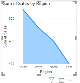

4. Area Chart:

Showing cumulative sales in region using an area chart:


5. Scatter Plot:

Exploring the relationship between sales and product using a scatter plot:


6. Treemap:

Comparing sales by region and product using a treemap:


7. Gauge Chart:

Visualizing sales target vs. actual sales using a gauge chart:


8. KPIs:

Displaying key performance indicators (KPIs) like total sales and average sales using cards:


9. Matrix:

Comparing sales by region and product using a matrix:


10. Map:

Visualizing sales distribution on a map:


These visuals provide different perspectives on the sales data, enabling users to derive insights and make informed decisions.

Comments

Popular posts from this blog

Performance Optimization

Performance optimization in SQL is crucial for ensuring that your database queries run efficiently, especially as the size and complexity of your data grow. Here are several strategies and techniques to optimize SQL performance: Indexing Create Indexes : Primary Key and Unique Indexes : These are automatically indexed. Ensure that your tables have primary keys and unique constraints where applicable. Foreign Keys : Index foreign key columns to speed up join operations. Composite Indexes : Use these when queries filter on multiple columns. The order of columns in the index should match the order in the query conditions. Avoid Over-Indexing:  Too many indexes can slow down write operations (INSERT, UPDATE, DELETE). Only index columns that are frequently used in WHERE clauses, JOIN conditions, and as sorting keys. Query Optimization Use SELECT Statements Efficiently : SELECT Only Necessary Columns : Avoid using SELECT * ; specify only ...

DAX UPPER Function

The DAX UPPER function in Power BI is used to convert all characters in a text string to uppercase. This function is useful for standardizing text data, ensuring consistency in text values, and performing case-insensitive comparisons. Syntax: UPPER(<text>) <text>: The text string that you want to convert to uppercase. Purpose: The UPPER function helps ensure that text data is consistently formatted in uppercase. This can be essential for tasks like data cleaning, preparing text for comparisons, and ensuring uniformity in text-based fields. E xample: Suppose you have a table named "Customers" with a column "Name" that contains names in mixed case. You want to create a new column that shows all names in uppercase. UppercaseName = UPPER(Customers[Name]) Example Scenario: Assume you have the following "Customers" table: You can use the UPPER function as follows: Using the UPPER function, you can convert all names to uppercase: UppercaseName = ...

TechUplift: Elevating Your Expertise in Every Click

  Unlock the potential of data with SQL Fundamental: Master querying, managing, and manipulating databases effortlessly. Empower your database mastery with PL/SQL: Unleash the full potential of Oracle databases through advanced programming and optimization. Unlock the Potential of Programming for Innovation and Efficiency.  Transform raw data into actionable insights effortlessly. Empower Your Data Strategy with Power Dataware: Unleash the Potential of Data for Strategic Insights and Decision Making.