Slicers and filters are powerful tools in Power BI for enabling interactivity and allowing users to dynamically explore and analyze data. Let's demonstrate how to use slicers and filters with an example dataset:
Example Dataset:
Consider a dataset containing sales data for different products in different regions:

Using Slicers:
Create Slicer:
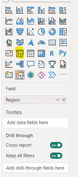
- In Power BI Desktop, go to the "Visualizations" pane and click on the slicer icon to add a slicer visual to your report canvas.
- Drag the "Region" field into the slicer.
Interact with Slicer:
- Users can now select one or multiple regions from the slicer to filter the data in other visuals accordingly.
- For example, selecting "North" in the slicer will filter the visuals to show only data for the North region.

Using Filters:
Create Filter:
- You can also use filters directly on visuals without adding a slicer.
- For example, click on the bar chart visual representing sales by region, then click on the "Region" field in the "Fields" pane and choose "Filters".

Interact with Filter:
- Users can now select one or multiple regions from the filter pane to filter the data in the visual accordingly.
- For example, selecting "South" in the filter will filter the bar chart to show only data for the South region.

Benefits:
- Dynamic Exploration: Users can interactively explore data by selecting different slicer values or applying filters.
- Customized Views: Users can customize their views of the data by selecting specific subsets or combinations of data.
- Insight Discovery: Interactivity allows users to discover insights and patterns in the data more effectively.
By leveraging slicers and filters in Power BI, you can create highly interactive reports that empower users to analyze data according to their specific needs and preferences.
Comments
Post a Comment